
- Euro & USD Indices
- General Stock Market
- Crude Oil
- Correlation Matrix
- Gold
- Silver
- Platinum
- Mining Stocks
- Letters from Subscribers
- Disproportion between the Dow, S&P 500 and gold
- Golden death cross technical formation
- US fighting China for control of physical gold
- The price of gold prior to Nixon’s announcement in August 1971
- Sometimes cyclical turning points just don't happen
- SP Indicators are better when compared to the buy-and-hold strategy
- Summary
Shula Kopf, a staff member of Sunshine Profits, just returned from a three-week visit to India and has filed a special first-hand report on India’s passion for gold.
To understand India’s fervent devotion to its religion and traditions you had to be there at the Kumbh Mela, the largest human gathering on earth, large enough to be visible from space satellites. I was there along with 30 million others on February 10 to witness the most auspicious day in the Hindu calendar to bathe in the confluence of the holy Ganges and Yamuna rivers. The Kumbh lasts six weeks from mid-January to March and it is expected that close to 100 million Hindus will make the pilgrimage. It takes place every three years, but every twelve years it is especially holy and draws the biggest crowds.
On my way to Allahabad, which is the closest city to the site, I saw thousands trudging along the roads carrying bundles on top of their heads, whole villages, men, women and children, in what looked like a Biblical procession out of a Cecil B. DeMille movie. They slept outside and bathed in rivers along the way. Once I reached the site of the Kumbh Mela, I checked into a tent “hotel” occupied mostly by westerners. Millions slept outside on straw which they had carried with them. At night I could hear the never ending cacophony of millions of people talking near their cooking fires, the chanting of sacred Vedic hymns and mantras. Millions awoke at dawn after sleeping on the hard ground to bathe in the cold waters of the rivers amidst garlands of floating marigold flowers. Thousands of dread-locked holy monks, called sadhus who live in isolation in caves, under trees or in ashrams, mingled with tens of millions of devotees.
Wanting to get to the main bathing site to see the Hindu monks take the first dip, I got caught up in a river of humanity that swept me along as if I were a twig. There was no turning left or right. The only option was to keep shuffling my feet forward inches at a time in the most tightly packed press of people that I had ever experienced. I was a tourist, but for the rest it was a reenactment of a ritual as ancient as India itself. I was afraid of a stampede and later learned that 36 people were crushed to death that day at the Allahabad train station.
The Kumbh Mela is held on a rotating basis every three years in one of four places where the Hindu scriptures say the gods spilt a drop of the elixir of eternal life. Kumbh means “pitcher,” a reference to the orb from which the elixir was dropped, the term “Mela” means “fair.”
Witnessing this once-in-a-lifetime spectacle makes you realize in the most concrete way how strongly Indians adhere to their ancient traditions. They still mostly marry within their own caste, as one can see in the matrimonial pages of the Sunday Times of India. The vast majority of Indian women wear saris. Outside major cities such as New Delhi or Mumbai one doesn’t see eating establishments that serve anything but Indian food. Cows roam unmolested in the middle of city traffic.
Yes, Indians hold fast to their traditions and one of their ancient traditions is a respect and love for gold.
The love of Indians for gold is almost a religion, a part of a culture that goes back thousands of years. Gold is the symbol of theHindu Goddess of prosperity, Lakshmi. The Hindu god Brahma was born from the cosmic egg of gold.
The accumulation of gold is a goal for all Indians from rich to poor and of all castes. Parents start buying gold for their daughters when they are little girls and gold is kept and accumulated in families and handed down the generations, sold only as a final resort.
There is a saying in India, “No gold, no wedding.” tradition demands a bride drip with gold jewelry. On the first night in India there was a wedding in the hotel where I was staying in Mumbai. The women, dressed in wondrous saris, were also adorned with gold jewelry, lots of gold jewelry, but the bride, most of all. It is expected that parents will buy their daughter a minimum of three matching sets of gold earrings, necklaces and bracelets to wear on the various days of the wedding party. The bride’s gold belongs only to her by right and is her insurance policy for hard times.
It is estimated that the Indian Central Bank holds about 557.7 tons of gold which puts it in the number 10 spot. India surprised the world in November, 2009 when it bought 200 metric tons of Gold from IMF at an average price of $1045 per ounce. But that is nothing compared to the amount of gold held in India in private hands-- approximately 18,000 tons of gold, more than any other country. Last year Indians imported 864 tons of gold, about one fifth of world sales, increasing India's trade deficit and weakening its currency. The government tried several measures to curb its citizens’ passion for gold (or to simply increase the budget inflows), including a recent new tax on gold imports, the third in a year that raises it to 6 percent.
But given the devotion I saw that Indians have for their traditions, it is not likely that any government act will be able to curb the passion for gold. Just this week Indian sources announced that gold demandwent up 41% to 262 tons during the October-December quarter as Indian households flocked to buy their favorite precious metal despite the high price. India is a rising economic powerhouse and the number of rich and middle class families now outnumbers the poor. Indian households save an estimated 30 percent of their income, compared to only about five percent for American households. The combination of rising incomes and savings prowess will enable Indians to buy more gold in the future. This week Britain's Royal Mint announced that it has started to manufacture gold sovereign coins in India for the first time in almost 100 years. The first production run will be for 50,000 pieces and will be available in the market immediately. The announcement coincided with British Prime Minister David Cameron's visit to India. Describing India as one of the ‘great phenomena’ of the century, Cameron, who is on a three-day visit to India, said the enormous growth of the country is going to make it the third largest economy by 2030. That is bullish for gold.
India has many people, many gods and many languages, 21 official and 600 dialects. But there is a word for gold in every single one of them and the power of gold is something all Indians understand.
To understand what is happening with precious metals this week let’s turn to this week’s technical part with the analysis of the Euro Index. We will start with the long-term chart (charts courtesy by http://stockcharts.com.)
Euro & USD Indices
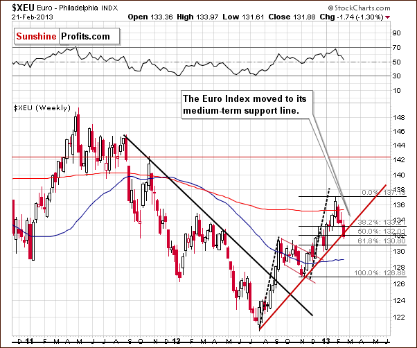
We begin our currency section with the long-term Euro Index chart. This week the index declined back to its important medium-term support line and it is likely that the bottom is now in. This support line is based on the 2012 low as well as subsequent lows in November and very early this year on an intra-day basis. Interestingly, the euro has now corrected one half of its November thru January rally. This new 50% Fibonacci retracement level support line is currently at the 132 level.
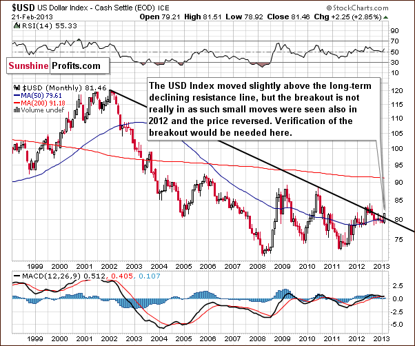
Turning now to the very long-term USD Index chart, we see a move this week above the declining long-term resistance line which normally would be a big deal. However, in the middle of last year when this happened, it was followed by an invalidation of the breakout and a subsequent decline. We expect to see the same thing here once again. Keep in mind that we have not seen a weekly close above this resistance line and really need to see several before stating that the breakout is truly confirmed.
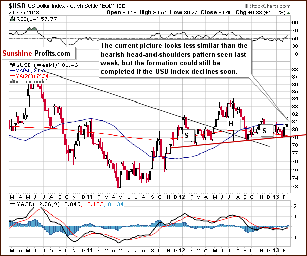
In the medium-term USD Index chart, included this week so that we could make some points about the head-and-shoulders pattern, we see that it is no longer perfectly symmetrical, but this does not invalidate the pattern. It could still be the case that a double right shoulder is forming. If the index declines below the 79 level, the pattern and the outlook will once again be just as bearish as if the breakdown took place last month.
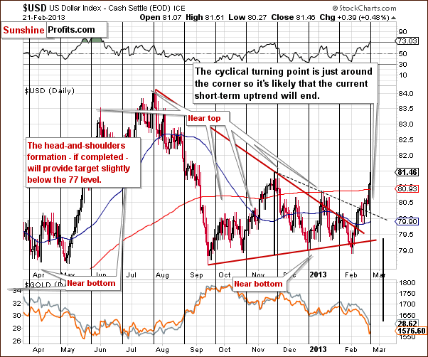
In the short-term USD Index chart, we see the index right at its cyclical turning point. The sharp rally this month brought the index to its November high and the last part of this rally severely exacerbated the decline of gold.
With the index at its November 2012 high, at a cyclical turning point, and with RSI levels above 70, a decline here is quite likely very soon if not immediately.
Summing up, the outlook remains bearish for the dollar and bullish for the euro, which has reached an important support line. The implications from the currency markets appear quite bullish for the precious metals sector in the weeks ahead.
General Stock Market
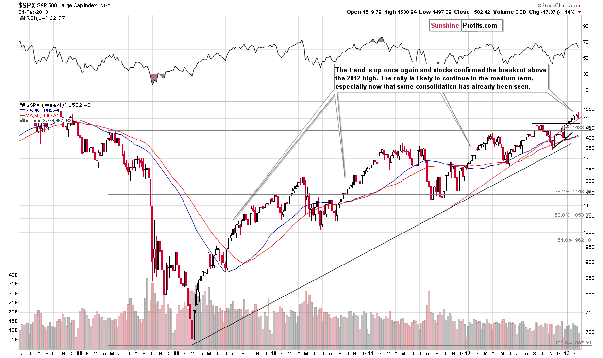
In the long-term S&P 500 Index chart, we see a small correction this week and this is consistent with what we stated in last week’s Premium Update:
…any declines will probably be very small. There is little chance that significant price declines will be seen any time soon because there are several strong support levels/lines close to the current value of the index. Yes, the RSI is close to being overbought but this situation persisted for months several times in the past few years without any significant correction.
The consolidation could already be over here and not much more is expected in the way of price declines. It seems to us that there are too many inflationary forces currently in play (open-ended quantitative easing for example) to have any volatile plunge in stock market prices.
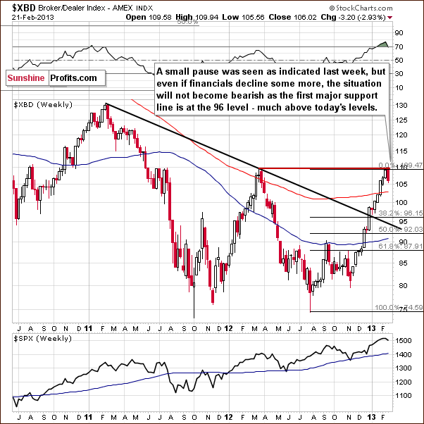
In the financial sector (Broker/Dealer Index serves as a proxy here) chart, we see a small correction which is quite insignificant in terms of the relatively high prices seen here for the past few months. A big decline would be needed here to invalidate the breakout above the declining resistance line.
As the outlook for the financial sector will very likely remain positive in the medium term, so will the implications for other stocks.
Summing up, the short-term outlook for stocks appears to be rather unexciting. Some consolidation or small price declines may be seen, but overall, we expect the uptrend to continue.
Crude Oil
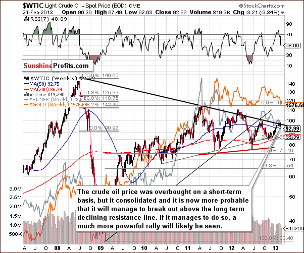
We now turn to the crude oil price chart where we see an overbought situation and still expect the long-term declining resistance line to be taken out fairly soon. Last week’s Premium Update comments are still up-to-date:
With some consolidation having been seen here, the odds for a breakout are much higher (60% or so) than they were a few weeks ago (40% or so). With higher stock prices and lower USD Index values, we expect the breakout in oil prices to materialize soon. Such a development could take other commodities as well as the precious metals to higher price levels.
Gold and Silver Correlations
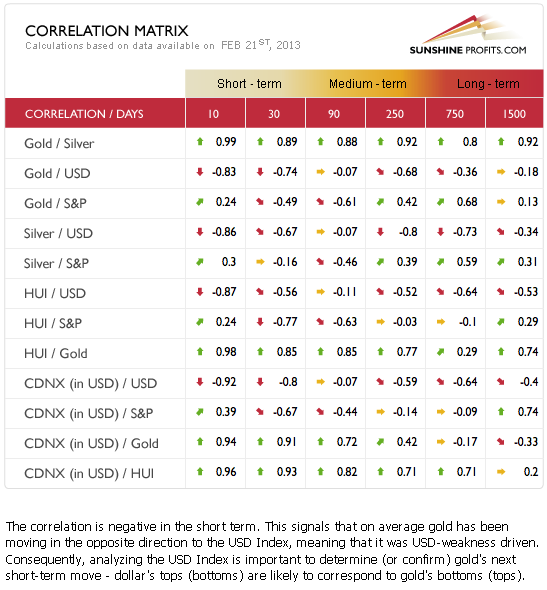
The Correlation Matrix is a tool which we have developed to analyze the impact of the currency markets and the general stock market upon the precious metals sector (namely: gold & silver correlations). We continue to see some return to normal between the precious metals and the USD Index. Unfortunately the reason is that precious metals declined as the USD Index rallied. Of course, this must be considered a better scenario than if the metals had declined in price for no apparent reason. The indications are that when the USD Index reverses, the precious metals will do the same. With the USD Index at a cyclical turning point therefore, we could very well see higher prices for precious metals and mining stocks in the coming weeks.
Gold
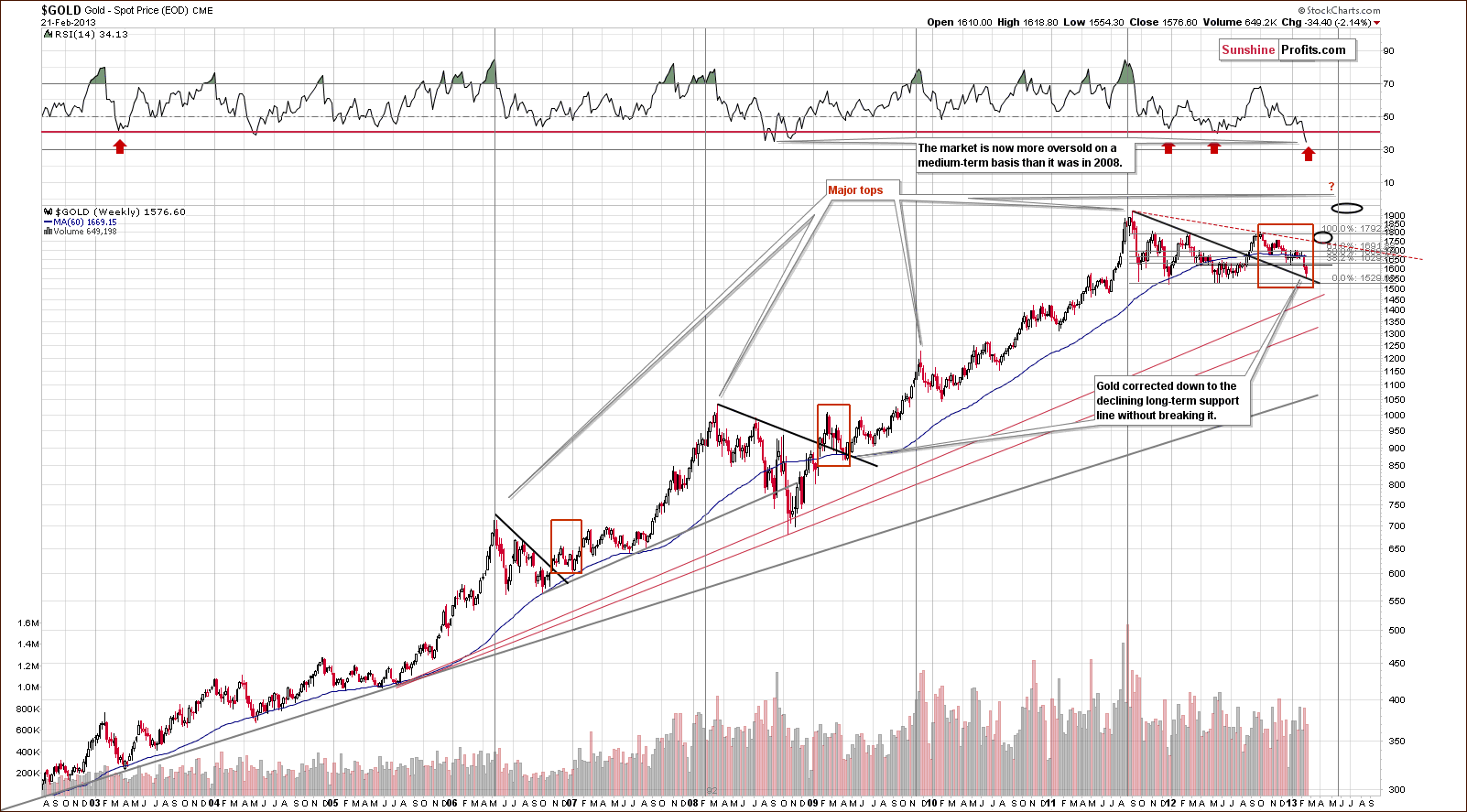
In this week’s very long-term gold chart, the most interesting point is not that prices moved to the long-term support line and reversed but rather the current RSI level, based on weekly closing prices. It is the most oversold since the beginning of the bull market and is now more oversold than after the 2008 plunge.
This is a huge deal. Even based on the above alone, the bottom could be in for gold prices. Since the long-term support line has been reached, the medium-term bottom is probably in, and prices are likely to rally in the months ahead. It seems that perhaps a major top will be seen close to mid-2013.
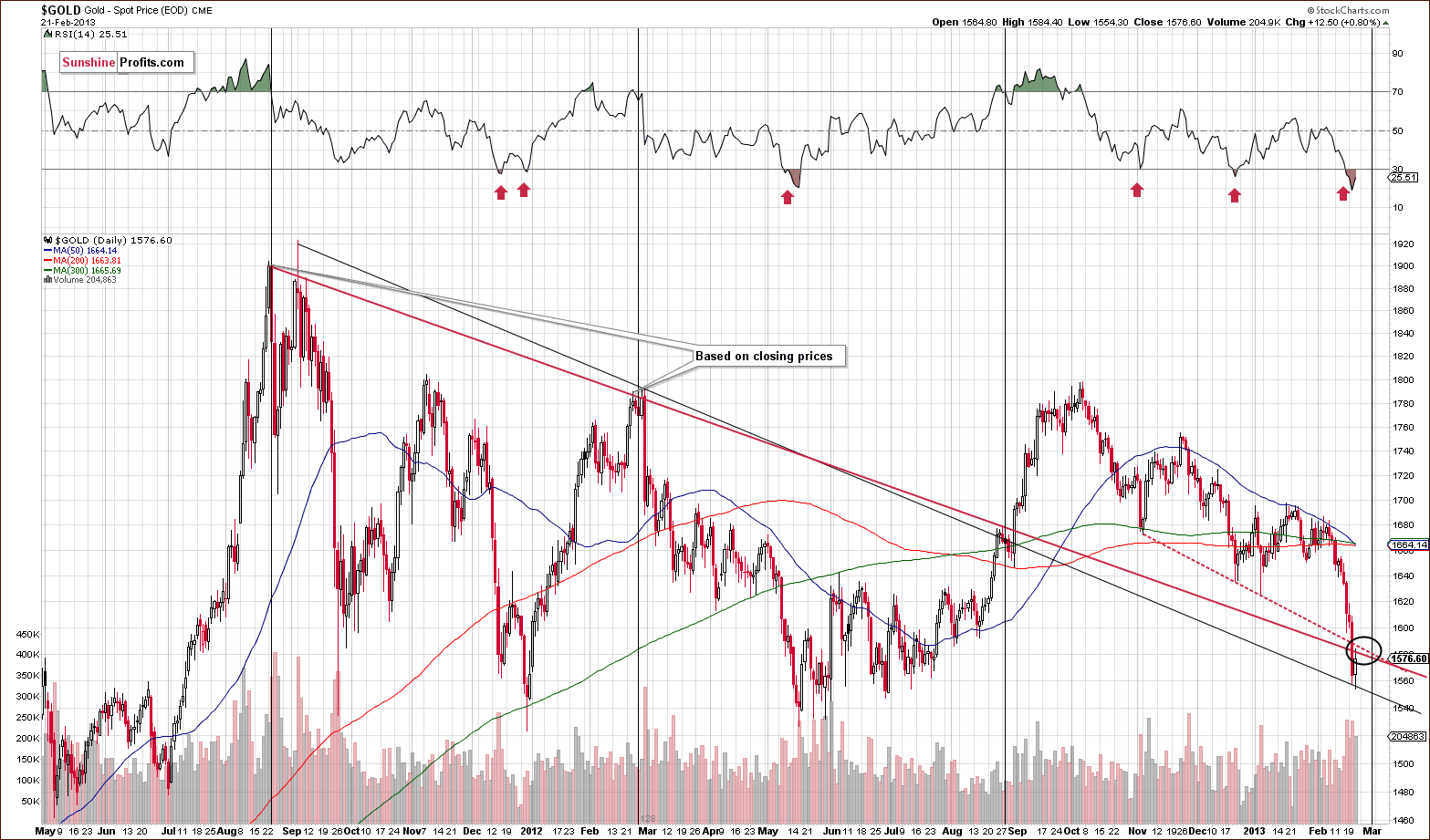
In the short-term spot gold price chart, we see that prices actually reached the target area this week. In Monday’s Extra Premium Update, we said that “We remain bullish on the precious metals sector in the medium term. At the same time we think that gold and the rest of the sector will move a little lower before the bottom is reached. ”
Our target price range was reached briefly on Wednesday (gold moved below it and moved back to it on Thursday) and it seems that the bottom is now in and visible on the long-term chart. It was visible also on the previous, long-term chart, but on this chart we see particularly clearly that the bottom is right at the long-term support line. The significant volume supports this being a local bottom.
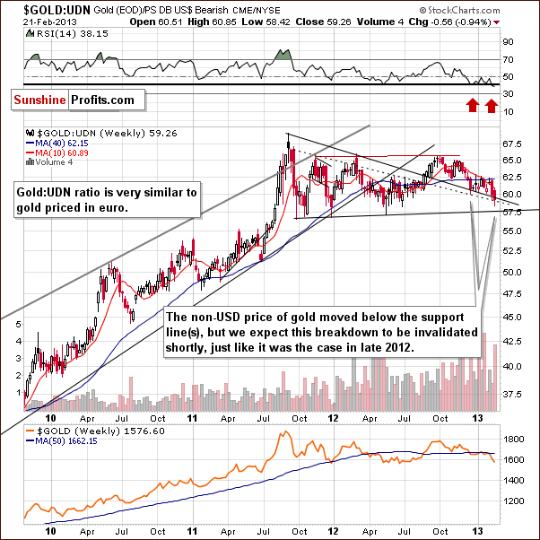
In this week’s chart of gold from the non-USD perspective, we continue to see a somewhat bullish picture. Extensive consolidation has been seen after the 2012 breakout. Gold moved below the declining support line this week and while the situation looks a bit discouraging, we expect the recent breakdown to be invalidated – likely today. The support line currently in play has held declines for several months now with only one previous quick dip below it which was invalidated towards the end of 2012.
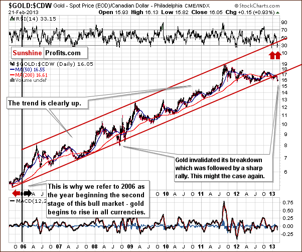
In this week’s chart of gold from the Canadian dollar perspective, we see that prices are now below the trading channel, much the same as was seen in 2008. That move was followed by a strong move to the upside, and with the situation heavily oversold here today, we expect prices to move back into the trading channel and rally sharply as we saw in 2008. Note the extremely oversoldRSI levels - see the red arrows in our chart.
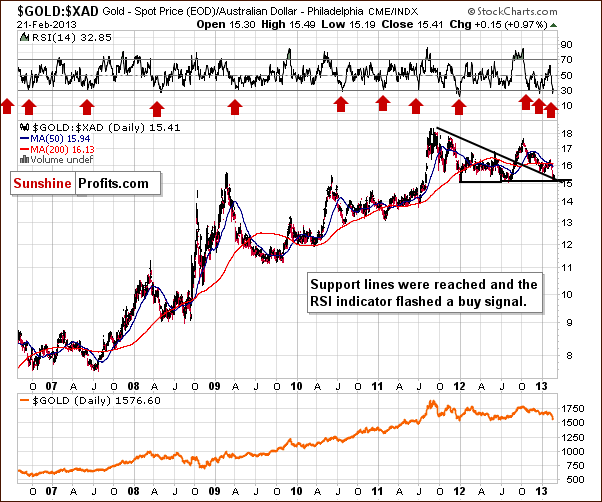
In this week’s chart of gold from the Australian dollar perspective, we have a similar situation. The RSI level here is heavily oversold as well but the difference is that no breakdown has been seen. Prices moved to the support line and no further making the implications here bullish as well.
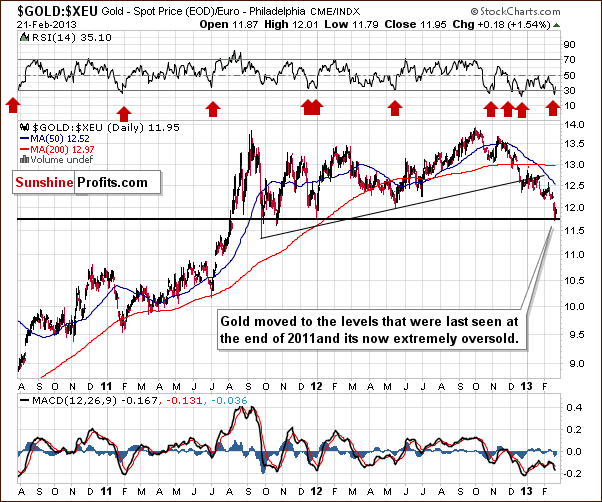
In this week’s chart of gold from the euro perspective, we saw a breakdown below the support line in late December. Prices are now at another significant support line and heavily oversold as well. This is a bullish combination, and we expect the declines in price to reverse soon.
Summing up, support lines are in play for many of this week’s gold charts and it’s likely that a local bottom has indeed formed. Additionally, RSI levels indicate an oversold situation. The outlook for gold from here is bullish.
Silver
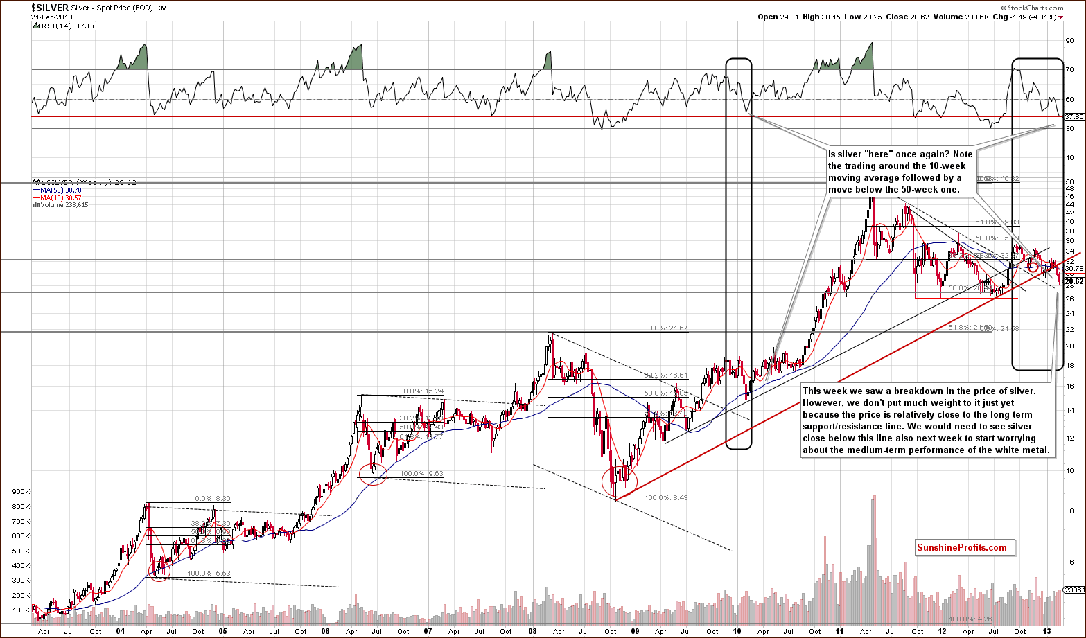
In this week’s very long-term silver chart, we see trading patterns similar to 2010. A slight difference is that recent price declines are smaller on a percentage basis than the big declines seen back then. We expect a pullback here with a sharp and sustainable move back above the rising red support/resistance line and ultimately higher.
There has been a breakdown below the red support line, but we prefer to see three weekly closes before stating that the breakdown is in. We have not yet see two weekly closes below this line, so the breakdown is far from being confirmed. RSI levels are at a red line of their own which has been a buy signal in the past.
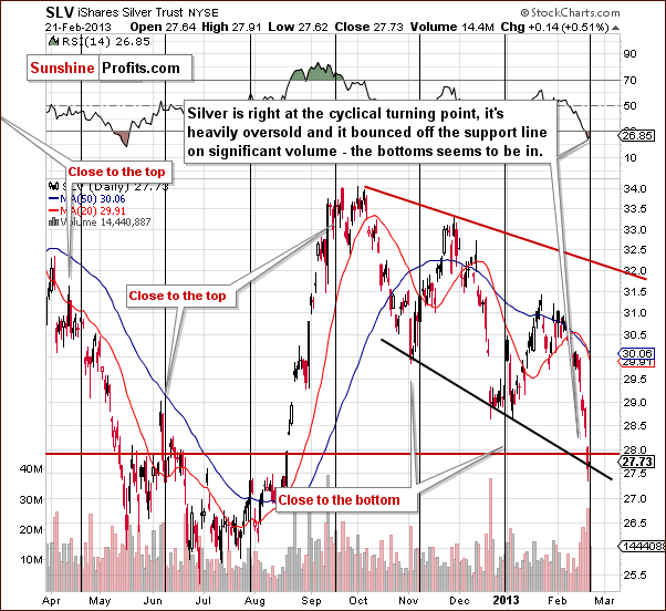
In the medium-term SLV ETF chart, we have a bullish combination of factors this week. Silver is at a strong support line, RSI levels are heavily oversold, and volume levels have been significant recently. The white metal has probably just bottomed, and with declines seen ahead of the cyclical turning point, prices are very likely to reverse and move higher.
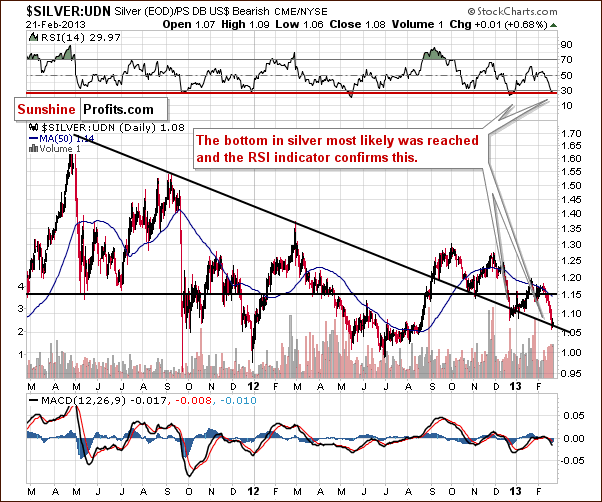
In this week’s chart of silver from the non-USD perspective, we have a situation similar to what we saw in non-USD gold prices. The situation is oversold with RSI levels near 30, and prices are at a support line created by highs in 2011 and 2012. The outlook is bullish here as well.
Summing up, the outlook for the white metal is bullish for many of the reasons seen throughout the charts in this week’s Premium Update. Support lines, cyclical turning points, volume levels and overbought situations all contribute to this bullish outlook.
Platinum
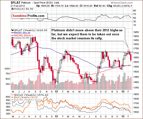
In this week’s medium-term platinum chart, we saw fairly significant price declines this week probably due to lower prices in the general stock market. The outlook remains bullish as significant price declines in stocks are not expected, and it will probably not be long before the rally resumes in platinum prices once again. We continue to believe that platinum will outperform gold in the months ahead.
Gold and Silver Mining Stocks
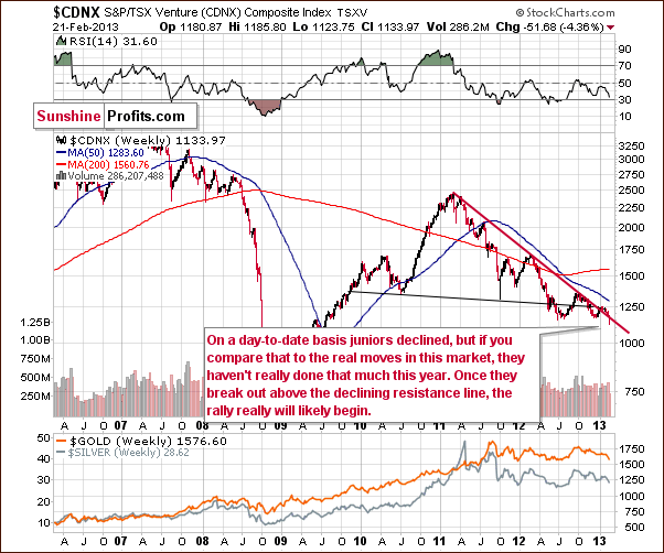
In the Toronto Stock Exchange Venture Index (which is a proxy for the junior miners as so many of them are included in it), we saw prices decline last week but in perspective, it was relatively small. A small show of strength here will once again bring prices above the resistance line with a rally likely to follow. Although we do not have bullish implications yet, this week’s weakness does not make the situation overly bearish either.
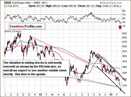
In this week’s HUI index chart, we see an extremely oversold situation and the recent move to the downside will likely be invalidated. If this invalidation is seen, it will be a strong bullish signal and index levels of 400 and then higher will be a real possibility.
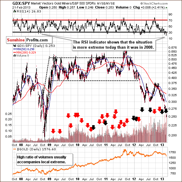
In the miners to other stocks ratio chart this week, we see an oversold situation once again and lower ratios as the miners have been underperforming other stocks. In 2008, a similar situation saw panic in the markets and the situation is even more extreme right now. It may in fact, be the perfect time to buy and the high ratio of volumes is also noteworthy as it generally accompanies local extremes.
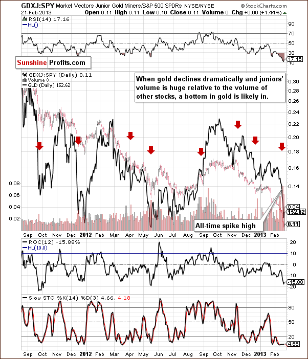
In this week’s juniors to other stocks ratio chart, we see the ratio of volumes recently reached an all-time high. As we wrote inTuesday’s Market Alert:
…a spike high had been seen shortly before in the ratio of volumes between these ETFs. These spike highs in the ratio of volumes heralded local bottoms many times in the past. On Friday, during the spike, the ratio of volumes hit an all-time high, so the buy signal here is very strong.
The situation is extremely oversold in RSI level and the implications are bullish here and for the whole precious metal sector.
Summing up, the outlook for the mining stocks appears bullish at this time as the sector is extremely oversold – more than in 2008 according to some measures. RSI levels and comparisons to previous similar cycles indicate that higher prices are very likely just ahead.
Letters from Subscribers
Q: If you have watched Wall Street recently, you see the equity markets have been soaring for 7 straight weeks. The Dow has hit 14,000 and the S&P 500 has reached its highest point since 2008. Obviously, investors have already shifted their strategy from precious metals to the stock market. If the US fiscal cliff/ debt ceiling issue can be resolved smoothly by March 1st, gold will further plunge and it could fall to $1,550 - $1,530.
A: With the disproportion between stocks and gold becoming so extreme, the contrarian approach suggests betting on gold's outperformance. We might be wrong here but it seems that there is no way of resolving the US fiscal cliff/ debt ceiling issue that would not be beneficial for gold. If anything bad happens to the economy, gold could move up as investors ditch stocks and switch to gold. If the problem is "fixed" by printing more money or a promise thereof, we have bullish implications for gold as well. Plus, gold moved close to $1,550 this week, so the bottom may be in, anyway.
Q: Could you please address whether we need to be concerned about the recent golden death cross technical formation. Thanks.
Thanks for the daily market alerts! They are very helpful, especially during these trying times!
A: We discussed the death cross in April, 2012, and here's a quote:
Yes, we do have something to say about the death cross in the precious metals market. Something quite to-the-point:
It doesn't work.
To be precise, in our opinion, it doesn't work as signaling a good moment to sell gold or silver. Actually, in most cases it was a very reliable buy (!) signal. Here are the moments where the death cross was seen in gold during this bull market:
End of Q2 2004 - right after a major bottom and before a big rally (lower prices were never seen after that bottom); Mid-2005 - right before a major bottom and before a huge rally (lower prices were never seen after that bottom); Beginning of Q4 2006 - right after a major bottom (lower prices were never seen after that bottom); Q3 2008 - in the middle of the 2008 plunge.
Which of these four scenarios is the odd one? The last one marked neither a good buying point nor a good exit point - it was right in the middle of the extraordinary decline. In all other cases the death cross was a bullish development.
Summing up, 3 out of 4 cases where the death cross was seen were great moments to buy and the 4th one was neither a good nor bad moment to buy.
Therefore, the implications of a death cross are actually bullish.
In reality, gold did move lower in the weeks following the above comment despite the bullish impact of the death cross (it sounds weird, but that's how it used to work), so we now have 3 out of 5 moments that were great times to buy gold, one average moment and one before a not-so-deep decline. It's still not bearish.
By the way, please keep in mind that we have a search function on our website (top right part of the page) that works very well - it breaks the results into sections and can you can also filter them by dates. We will happily reply to questions in this section of updates and the , but we are naturally not able to provide answers 24/7, and our search engine can do it instantly. You can try searching for “death cross” and you will find, for instance, similar comments for the silver market.
Q: I think this could be the US fighting China for control of physical gold because the Americans are afraid of the dollar losing its role as the reserve currency. The US has no doubt seen how China, Russia, India and others buy large amounts of physical gold. And I suppose they do this to prepare for this to eventually occur. At the same time, when the decline in gold started, it was announced that it would take 7 years for Germany to get back 300 metric tons of gold (amazing in my opinion) and according to rumors China will eventually declare that their currency, backed by gold, will be the new reserve currency.
We might therefore be in a situation similar to the one before Nixon abandoned the dollar’s convertibility to gold in 1971. It would therefore be natural for the US to depress the price of gold and shake out weak hands in order to take the opportunity to accumulate as much gold as possible to defend the dollar and keep the German gold as long as possible.
My question is: did the price of gold decline prior to Nixon’s announcement in August 1971 after which it exploded upwards? Best regards.
A: Gold declined in the second half of 1969 and then moved higher and there were no meaningful corrections before late 1972 (and this one wasn't major either).
Whatever the authorities might do to the gold and silver (!) market, the effect will likely be only temporary as in the end the market forces should win. People are ditching their gold investments now, which has nothing to do with fundamentals. With open-ended QE in place along with near-zero interest rates, gold is practically bound to rally. The 7-year waiting period for 300 metric tons of gold is indeed amazing. It's a red alert and final warning for those who haven't bought any physical precious metals just yet.
The 7 year period which hit the headlines in late January this year was actually defined back in Oct 2012, and we also wrote about it in the Nov 2, 2012 Premium Update.
Simple math tells us that repatriating 300 metric tons at 50 metric tons a year must take at least 6 years to complete. The most interesting thing about this is how long the markets took to react to this news (there was still no major rally).
Q: Hi there, I was wondering if sometimes cyclical turning points just don't happen at all. For example, we've been waiting for a cyclical turning point in the USD but it just hasn't happened. And it now seems to be forming a right shoulder of a head-and-shoulders pattern. Is there a variable or certain rule about cyclical turning points that I don't know about and would like to understand?
(…) Also, oddly enough silver seems to correlate somewhat positively with soybeans, which just turned up lately! Thanks.
A: Yes, sometimes cyclical turning points just don't happen - just like any technical tool. Good tools work most of the time and excellent tools can be expected to work 80% of the time or so (and it can be the case that something doesn't work a few times in a row only to then work 20 times in a row). Expecting anything more than 80% is not really realistic and thus cyclical turning points also have to not happen at times. It still seems that they will work this time, though.
Silver and soybeans - it's quite common to see two or more commodities move in the same direction and the same applies to other markets as well. For instance, the Dow Jones Transportation Average and Dow Jones Industrial Average are also highly correlated.
Q&A: We also received a few comments about our tools and whether or not they should have suggested that a decline in gold was coming. The tools that we currently provide (more precisely, timing tools, the SP Indicators) provide buy signals only. That makes it difficult for them to suggest profitable trades when gold either consolidates or declines. They have suggested being out of the market during a part of the move lower, so compared to the buy-and-hold strategy they are still better.
This will not always be the case. In fact, we will give you a preview of a separate tool dedicated to providing price paths of gold, silver and individual mining stocks (!) shortly (most likely in early March). In the Dec 21, 2012 Premium Update we provided a screenshot in the Extra Chart section, and as you can see it also gives sell signals and can provide a downward sloping price path. Yes, this tool suggested a plunge in gold several days before it happened. We didn't take the indications as important as it was still in the testing stage, but it has just once again proved its reliability and usefulness and so the testing period will soon be completed.
Summary
The USD Index rallied significantly this month but now appears overbought and at both a resistance line and a cyclical turning point. With the Euro Index at a support level and likely to soon move higher, declines for the dollar are quite likely to be seen from here.
In the general stock market, price declines may already be over; any further declines will not likely be significant. A period of consolidation seems most likely to be ahead. Numerous support lines are in place to hold any declines in check for the foreseeable future.
The important implications for the precious metals are bullish as lower USD Index values are expected in the coming weeks. This development will likely lead to higher prices for gold, silver and the mining stocks. Overall, the situation in the precious metals markets is critical as major support lines have been reached and many markets are extremely oversold. Investors’ sentiment has been very negative and the indicators and volume levels confirm this.
Taking all indications into account, it seems we have a much more negative picture than back at the 2008 bottom. It is certainly a time when others are fearful. It’s time to step up and be brave. This is why we suggest betting on higher precious metals prices with speculative capital and remaining in the precious metals with long-term investments. If you didn’t act on our previous suggestions to go long, we still suggest to do so right now.
Trading – PR: Long position in gold, silver and mining stocks
Trading – SP Indicators: Long position in gold, silver and mining stocks
Long-term investments: Remain in the market with your precious metals holdings
| Portfolio's Part | Position | Stop-loss / Expiry Date |
|---|---|---|
| Trading: Mining stocks | Long (full) | 352 / Mar 6, 2013 (half) |
| Trading: Gold | Long (full) | $1,544 / Mar 6, 2013 (half) |
| Trading: Silver | Long (full) | $28.20 / Mar 6, 2013 (half) |
| Long-term investments | Long | - |
This completes this week’s Premium Update. Our next Premium Update is scheduled for March 1, 2013.
As always, we'll keep you updated should our views on the market change. We will continue to send out Market Alerts on a daily basis (except when Premium Updates are posted) at least until the end of March, 2013 and we will send additional Market Alerts whenever appropriate.
Thank you for using the Premium Service. Have a profitable week, a great weekend!
Sincerely,
Przemyslaw Radomski, CFA

