
- Euro & USD Indices
- General Stock Market
- Crude Oil Prices
- Correlation Matrix
- Gold
- Silver
- Platinum
- Mining Stocks
- Letters from Subscribers
- SP Indicators vs buy and hold
- Silver performing better than gold
- In which exchange have gold and silver soared?
- Is your strategy and diversification meant for ALL of my assets and wealth?
- Summary
Say “Switzerland” and the word “banks” is the first thing that comes to mind (unless you are a chocoholic.) For centuries wealthy people have stashed their money and gold in safe and convenient Switzerland. But last month, UBS and Credit Suisse imposed negative interest rates on short-term cash deposits (as ridiculous as it may sound, maybe the Fed and other monetary authorities will follow their lead eventually?) in an attempt to stem inflows from investors seeking a haven from the eurozone crisis. And now it seems that Swiss banks are demanding higher fees to accept and hold bullion, according to a Financial Times article which says that large Swiss banks, UBS and Credit Suisse, have raised their charges for holding gold. It’s almost as if they don’t want your money and they don’t want your gold.
According to the FT, the banks want to persuade their biggest clients – including other banks, and institutional investors – to take direct ownership of their gold in “allocated” accounts, with the bank simply acting as a custodian. The norm today is to have “unallocated” gold accounts where the depositors’ gold appears on banks’ balance sheets, forcing them to increase their capital reserves. UBS and Credit Suisse, like their peers, are under regulatory pressure to reduce capital-intensive activities ahead of the introduction of Basel III global banking rules.
Fees vary and traders say the increase was generally in the order of about 20 per cent. Vault fees are typically about 0.05-0.1 per cent of the value of the gold. Allocated accounts are generally more expensive since unallocated holders can lose their investment if a bank fails, but holders of allocated gold are protected.
We’re still mulling over the implications of the surprising move by Germany to repatriate its gold from Paris and New York to its own vaults in Frankfurt.
We mentioned last week that perhaps the move is a sign of growing mistrust among central banks. We also wrote that Germany wants to have its gold close at hand in case the economy spirals downwards. We also wondered why it would take such a long time—7 years—to transfer 300 tons from New York back to Frankfurt. We’re talking the year 2020. Perhaps the Bundesbank is worried that its gold held at the Fed’s vaults may be over-pledged. Could it be that the New York Fed has leased it out and it will take all that time to get it back or buy it back? It will be interesting to see what will happen if other countries ask to repatriate their gold. It would not surprise us if this becomes a trend. It would indicate a real fear by those in the know — central banks.
It has occurred to us that perhaps Germany wants to have its gold reserves on hand to back up a new Deutsche Mark in case the Euro fails. That is food for thought.
The Germans know what they are doing. Germany wants its physical gold close at hand. That is what we have been strongly suggesting here at Sunshine Profits all along. Get physical gold for the long term and keep it safe and accessible.
We like to look at studies that have to do with gold. This one is funded by the World Gold Council and finds that gold may be a cheaper tool to use as a hedge against swings in emerging-market currencies. WGC examined eight periods of “crisis conditions,” and found that returns from portfolios that included gold in hedging were 2.4 percent better than investments lacking measures to counter exchange-rate risk. Gold topped currency hedges by 1 percent, the group said this week in a statement. This is especially interesting given the economic growth in emerging markets along with “aggressive” monetary policies. This has led to increases in interest-rates disparities and higher exchange-rate hedging costs, which makes the study relevant for those who do business or invest in emerging markets.
On the light side, we go today to an Irish Pub (is there a better kind?) in Tipperary to bring you a story about a hoard of gold coins dating back almost 400 years that was discovered hidden in soil beneath the pub’s floor boards. There must have been some lively Irish singing after the discovery and perhaps some energetic leg and foot movements. Unearthed during renovations, the 81 coins were described by the National Museum of Ireland as “one of the most significant finds of 17th century gold coins ever found in Ireland.” According to the Belfast Telegraph, the coins consist of mostly guineas and half-guineas dating back to the 17th century and depict the reigns of Charles II, James II, and William and Mary. The coins were minted following the English Civil War until 1813, when Britain adopted the gold standard. The name "guinea," by the way, is derived from the West African origin of the gold which was supplied by the Africa Company operating along the Guinea Coast. The coins are considered archaeological objects, which legally become property of the State.
Here is an even more exciting story. A 1794 silver dollar was sold at auction last week for a head-turning, record-breaking, whopping $10,016,875, according to Stack's Bowers Galleries, an auction house. This set a record for any coin, overtaking the 2002 record price set for a 1933 double eagle, a $20 gold piece that was sold for of $7,590,020. (If you’re wondering about the $20 in the sale price, it was added to monetize the coin and make it legal tender.) The gain for the silver dollar amounts to a little more than 1 billion percent. That’s a compound annual gain over the span of more than 200 years of 7.6 percent.
Speaking of coins, the U.S. Mint resumed sales of American Eagle silver coins after having suspended them for more than a week due to a lack of inventory. The Mint sold 1.123 million ounces of the coins in one day this week. Sales this month totaled 6.01 million ounces before the suspension, compared to 6.107 million ounces in January 2012. On Jan. 17 the Mint suspended sales after ‘temporarily’ selling out. Sales of American Eagle gold coins so far this month are 84 percent higher than the total for December.
To see if February will be promising for precious metals let’s turn to this week's technical part with the analysis of the USD Index. We will start with the short-term chart (charts courtesy by http://stockcharts.com.)
USD & Euro Indices
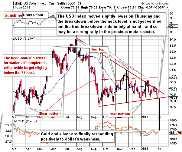
Our currency section this week will be rather short since we discussed matters in great detail last week. We begin with the short-term USD Index chart. No convincing breakdown below the neck level of the head-and-shoulders pattern has been seen yet, but it is pretty much at hand right now. A breakdown followed by a confirmation of it is needed, and once seen, this will likely be followed by bigger declines based on this bearish, short-term trading pattern.
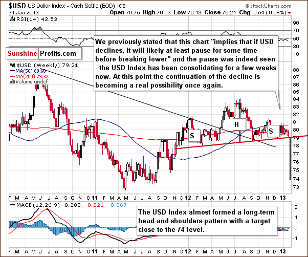
We see that the short-term breakdown will lead to an even bigger decline here in the medium-term USD Index chart, based on the medium term head-and-shoulders formation.
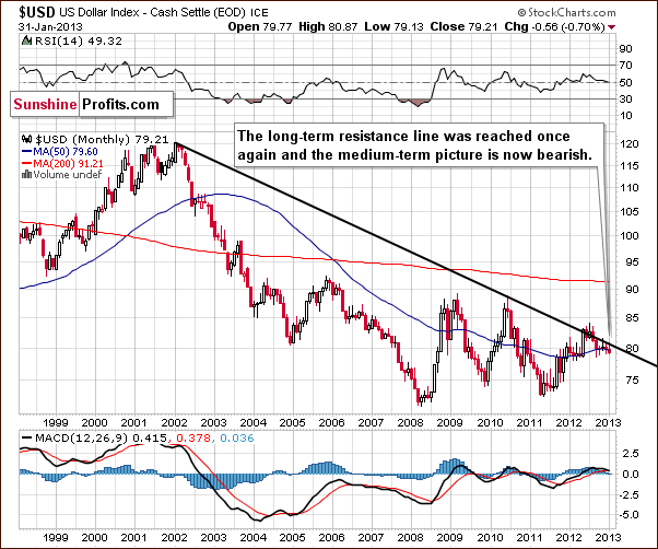
We then ask if declining prices based on the bearish short and medium term trading patterns are possible here in the very long-term USD Index chart as well. The answer is yes, since the long-term resistance line has been reached several times without being broken. This has bearish implications for the weeks ahead.
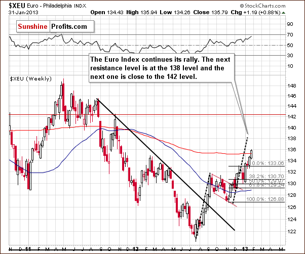
We now look at the long-term Euro Index chart. We see a strong rally this week and also note that upside target levels are still quite a bit higher. Consequently, the picture here is still bullish.
Summing up, higher precious metals prices are probably close at hand now since the USD Index has declined below the head-and-shoulders formation. The true rally in the precious metals sector seems poised to begin soon.
General Stock Market
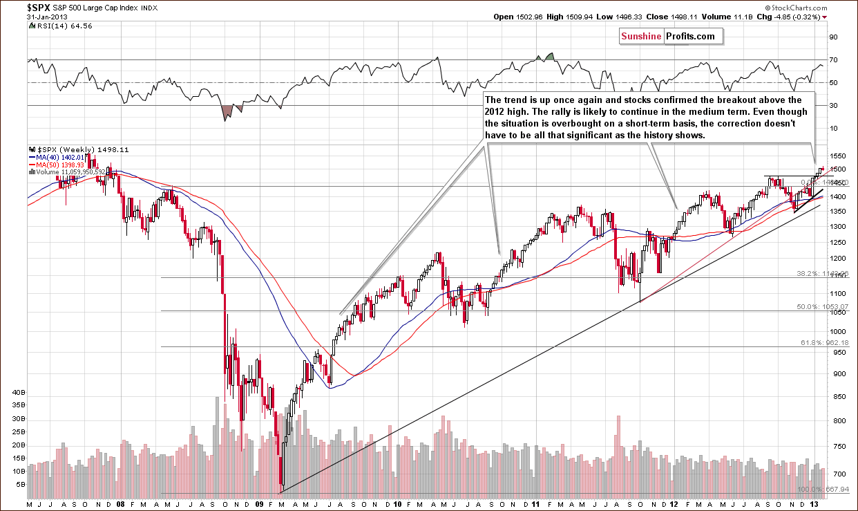
In the long-term S&P 500 Index chart this week, we saw a small consolidation in stock prices. Just because stocks are overbought on a short-term basis does not mean that a correction will be seen immediately as far as stocks are concerned. The general stock market can rally for months without a bigger correction (there insignificant ones are seen, though) and this is something which could be going on right now. The quantitative easing issues and the historically low interest rates all contribute to higher nominal stock prices and can certainly push them even higher.
In short, the above chart “says” that big declines are very unlikely. Small declines could be seen but are not very likely - they are likely, but we wouldn't be surprised to see some trading sideways here.
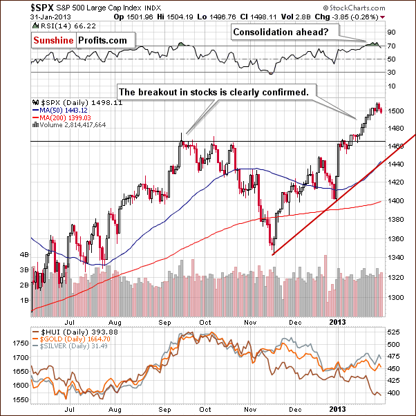
In the short-term S&P 500 Index chart, the situation is overbought but no longer extremely so. The small consolidation seen in the past two days has already cooled emotions somewhat, so if we see another few days of trading sideways or a small decline, the rally could very well continue.
Summing up, the situation in stocks is not crystal clear at this time for the very short term. A small decline or some consolidation or a continuance of the rally could be seen in the coming days. It is unlikely that any big declines in stock prices will be seen anytime soon.
Crude Oil Prices
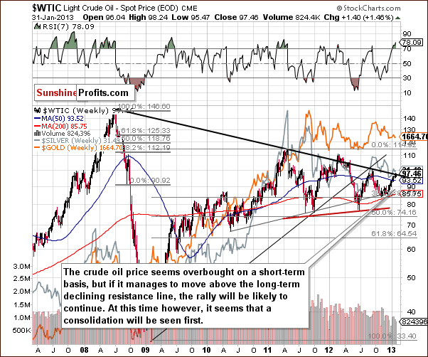
In looking at crude oil prices, we have an interesting situation where crude oil’s price is overbought on a short-term basis, but prices are at the long-term resistance line. If a breakout is seen followed by some consolidation above the resistance line, it likely would lead to a bullish impact upon the whole commodity sector. It seems however that investors don’t believe that this resistance line will be breached. This could be one of the reasons they are selling mining equities. If commodity prices move higher (seems likely with declines in the USD Index), this could influence the prices of gold, silver and gold and silver mining stocks in a positive way – in the following weeks (the reaction here does not have to be immediate).
Gold and Silver Correlations
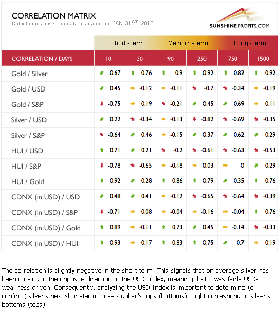
The Correlation Matrix is a tool which we have developed to analyze the impact of the currency markets and the general stock market upon the precious metals sector (namely: gold & silver correlations). The most notable correlation this week concerns silver. Its price has responded positively and it is negatively correlated with the dollar over the past 30 days. Silver’s price has moved somewhat with stock prices but the coefficient is quite low.
The rest of the precious metals are not linked to currencies and stocks in the normal manner. This is especially true for the mining stocks which currently have a negative correlation with the general stock market on a short-term basis. This means that the miners have seen lower prices while we would expect a rally due to the recent bullish picture in the general stock market.
This topic was discussed in Thursday’s Market Alert:
Our explanation here is that gold and silver investors don't really believe that the worst is over yet and didn't take gold's and silver's rally seriously… Let's examine the situation from the emotional perspective - most investors/traders will view a market that has been declining for over 4 months on average as very discouraging and will wait for a bigger rally as a proof of the strength before they enter this market based on gold's rally.
Gold
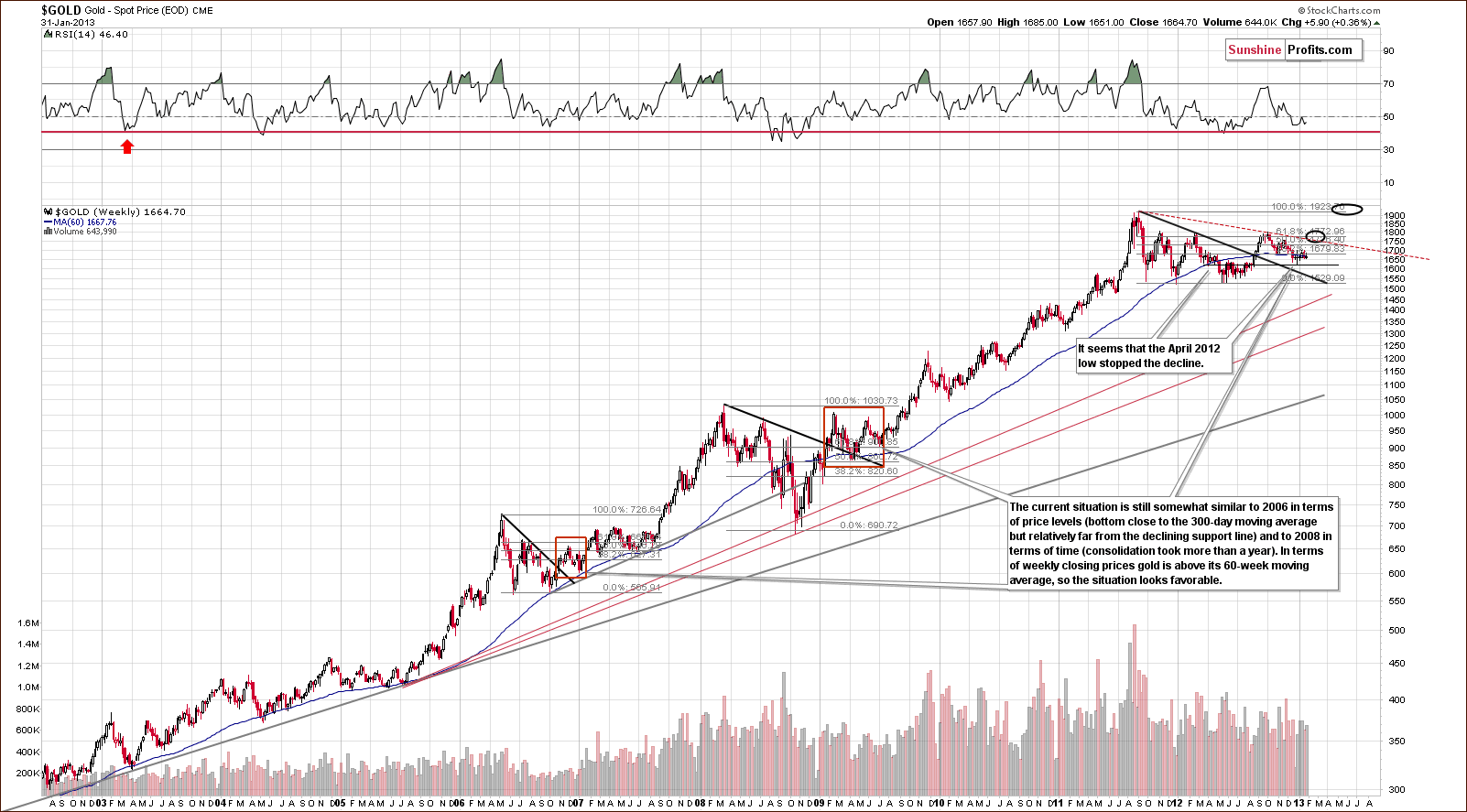
In the long-term gold chart, little change has been seen this week, but this chart is important for a reason which will be touched on when we summarize the gold section this week. The bottom was very likely formed here a few weeks ago when gold prices dipped below the 300-day moving average, which is a very important long-term technical development. Prices now appear to be simply consolidating a bit, which is also in tune with the historical patterns – the rally didn’t always start in a volatile way after the final bottom was reached below the 300-day MA – but it happened eventually many times and on each occasion the rally was worth waiting for.
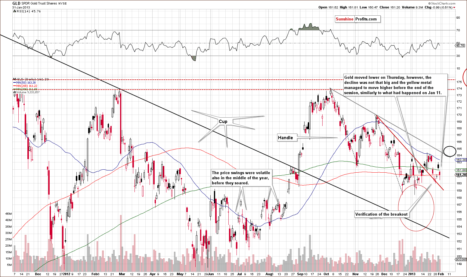
In the medium-term GLD ETF chart, we see that prices moved lower this week but are still above the declining short-term resistance line. While significant volatility has been seen on a short-term basis, the average price has moved very little over the last month and a half.
The situation is very similar to mid-2012, where back and forth price movement was eventually followed by a huge rally. Those whom were not prepared, say last August, would have missed a large part of the upside move. This is why we continue to say that betting on higher gold prices is a good idea and that patience will pay for itself.
The price action seen on Thursday was quite similar to January 11, where gold corrected after a short-term powerful upswing and managed to move higher before the end of the session. The outlook was bullish then and we think it’s bullish right now as well.
The rally will likely really pick up after gold moves above the declining medium-term resistance line (black ellipse on the above chart).
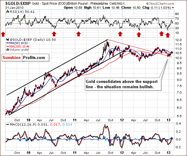
In the chart of gold from the perspective of the British pound, we see that gold is rallying and the picture looks bullish. Higher prices are expected here.
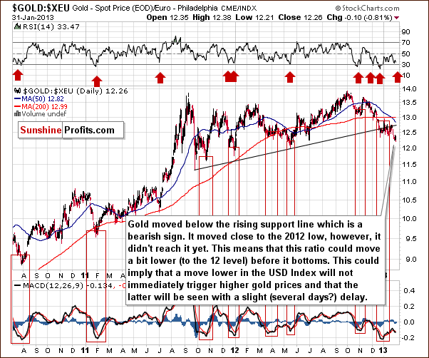
In this week’s chart of gold from the euro perspective, we saw a breakdown below the rising resistance line and the next support line is at the 2012 low. Since this level has not been reached yet, it seems we could see some weakness on a short-term basis.
Does gold have to decline based on that – from the USD perspective? Not necessarily. Quite simply, gold could not rally immediately if the dollar declined. Gold priced in euro could move slightly lower and if gold then catches up or rallies more significantly then the dollar declines, the price of gold in euro would rally. This chart does have some clearly bearish implications, however.
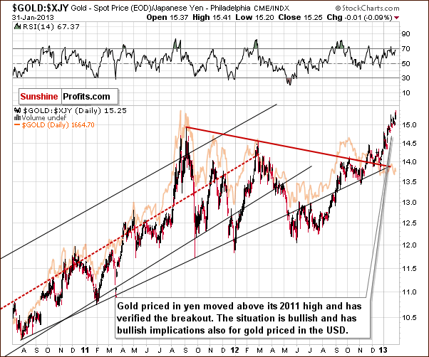
In this week’s chart of gold from the perspective of the Japanese yen, the outlook is bullish as a breakout above the 2011 high has been seen. More importantly, the breakout was verified as prices stayed there for more than 3 consecutive trading days.
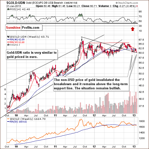
In this week’s chart of gold from the non-USD perspective, on average, gold prices have moved back and forth for a few months now. They are just above a key support line, however, and the situation remains bullish. The RSI level suggests a buying opportunity.
Summing up, quite a few strong signals are seen in the gold charts this week. Gold price in euro is a bit bearish, and price volatility can be expected in the coming weeks. With so much going on, and so many factors in place, we feel we must emphasize keeping what’s most important right in front of you. This is crucial and is why we keep featuring gold from the very long-term perspective, even though quite often, there are little changes from week to week.
The main point is that gold moved below the 300-day moving average (after already a lengthy consolidation) and then back above it. This accompanied major bottoms in the past, and we think that another is once again behind us. The ongoing debate now is whether consolidation will end immediately or if we will witness more sideways trading before the rally proceeds. The fundamentals are in place and gold will seemingly have to eventually rally. Taking all volatility signals along with the long-term gold picture into account, it seems that the next move will be to the upside, not down as the gold in euro picture might suggest.
Silver
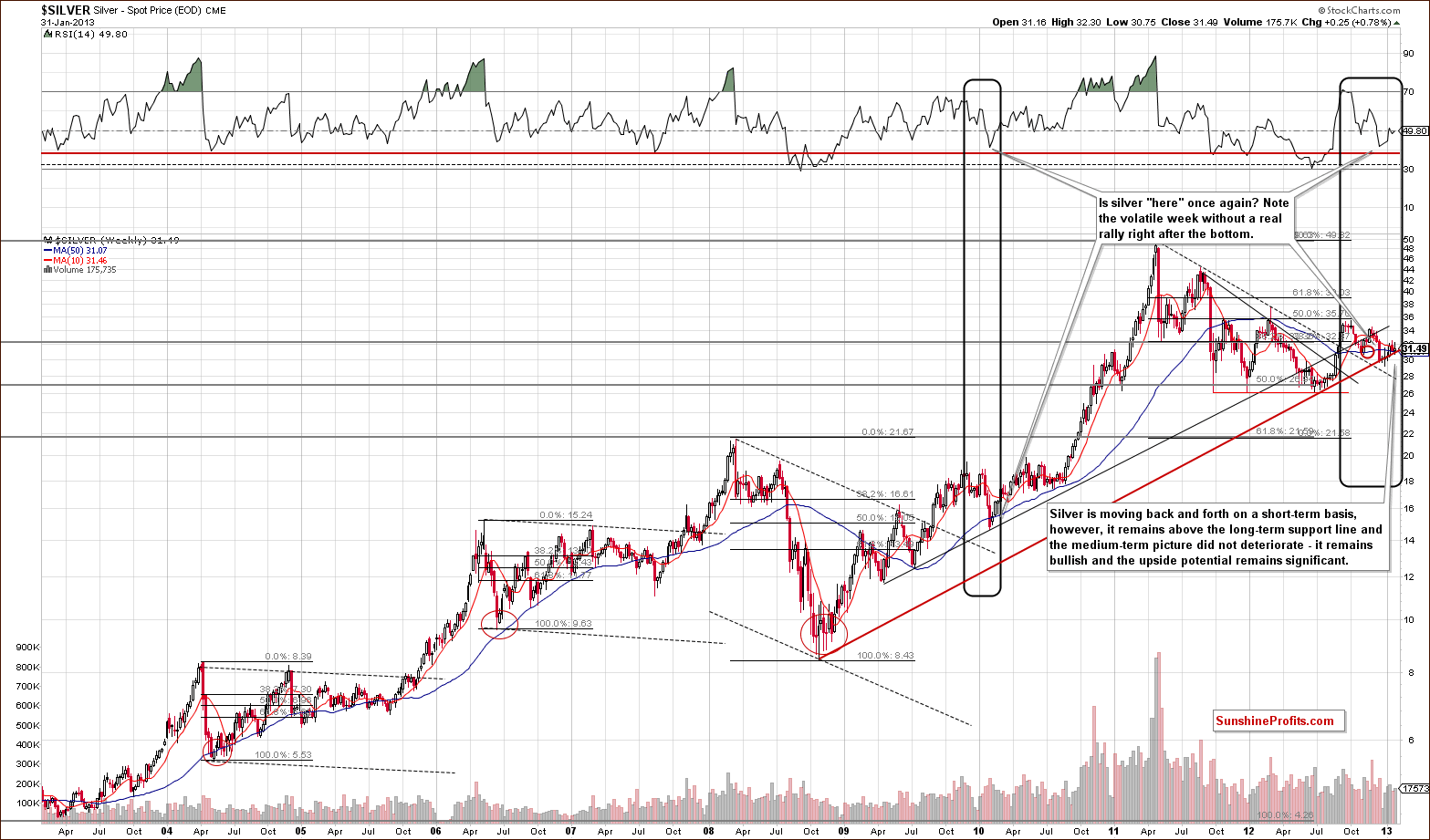
In this week’s long-term silver chart, we again must emphasize the importance of looking at the big picture which should always take precedence over short-term charts. In silver’s long-term chart, we see that prices tried to break down below the long-term support line but failed. They are now back above this line, and, after rallying, touched the resistance-support line once again. So, we have a bullish situation with bullish implications for the long, medium and short term. Short-term implications come from this long-term chart as well because silver’s current price is close to the long-term support line, and it seems unlikely to move much lower right now.
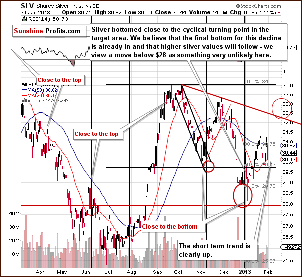
In the short-term SLV ETF chart, it seems that the rally in silver’s price so far in 2013 has been quite strong. We see that prices have risen on significant volume, and a final bottom has already been reached close to the cyclical turning point at the beginning of the year. Note that silver managed to move considerably higher before the end of the session Thursday after touching the 20-day moving average.
Summing up, the implications are bullish for the white metal based on the long-term and short-term charts. The long-term chart, as always, should be considered much more important, so while the short-term picture doesn’t imply an immediate rally, it is still very likely based on the long-term chart and the long-term support line that it features.
Platinum
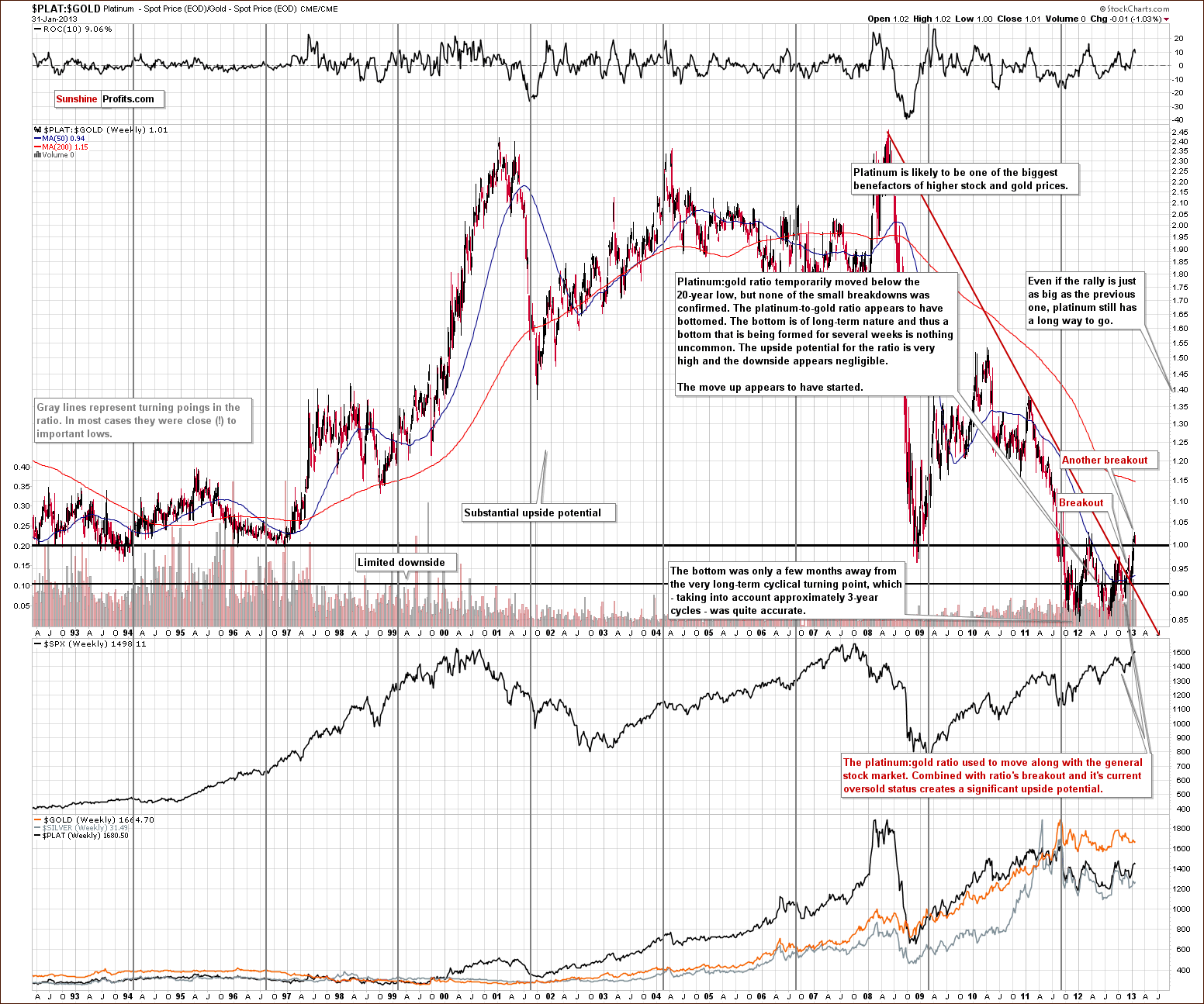
In this week’s platinum to gold ratio chart, we see the ratio is now above 1.0, and the breakout is being verified (successfully so far). Platinum is now more expensive than gold. The ratio broke above 1.0, moved back to it and has moved slightly higher again. We could see more consolidation here, but the long-term implications remain unchanged. Platinum is expected to outperform gold in the months ahead, and the ratio is therefore expected to move higher as well.
A major bottom was seen at the end of 2011 (close to the powerful long-term turning point) and in early 2012. A breakout has now been seen above the long-term declining resistance line in this ratio, and it seems that a big comeback for platinum to much higher prices is likely. This will pay off big time for those invested in platinum for the long run.
Gold and Silver Mining Stocks
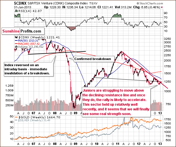
In the Toronto Stock Exchange Venture Index (which is a proxy for the junior miners as so many of them are included in it), we see prices still struggling to move decisively above resistance levels. They will manage to do so eventually, it seems, and may simply be waiting for a decisive move in gold and silver prices. Once this takes place, the upside appears significant here.
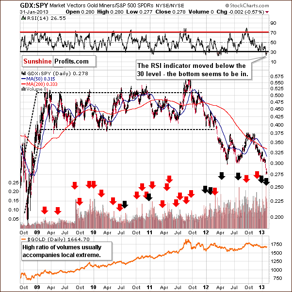
In this week’s miners to other stocks ratio chart, we see the ratio moved lower once again. The ratio between GDX and SPY ETF volumes reached an all-time high recently, which likely meant local bottoms for the precious metals mining stocks and the rest of the sector. RSI levels moved higher but are still heavily oversold suggesting that the upside potential is significant. Even if it wasn’t, we would expect this ratio to rebound anyway based on the RSI alone.
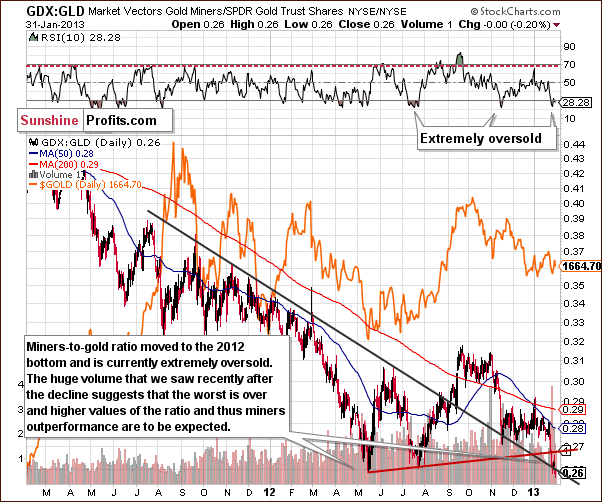
In this week’s miners to gold ratio chart, the ratio moved to the 2012 low so things are as bad for miners now as they were in mid-2012. This is an important support level. Because of the declining resistance line in place right now, very high volume levels, and a very oversold RSI, the picture suggests a rebound here. A bigger rally will likely follow.

In this week’s HUI Index chart, the situation does not look good at all. It seems that gold stocks have broken below the declining support line and verified this breakdown, so this chart on its own is bearish. The situation is extremely oversold here so more consolidation or a bigger pullback is still somewhat likely.
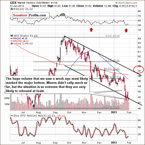
In this week’s GDX ETF chart, we see very high volume levels for the week. It’s likely that an important bottom has been reached. If a declining trend line is drawn on the chart based on previous resistance lines and a parallel line drawn as well, it creates a trading channel. The miners have moved to the lower border of the channel so this supports the rally theory and the stochastic indicator also gives us a buy signal this week. It seems that we are at a good spot for a local bottom.
Summing up, taking all the charts ratios into account, the situation is certainly extreme. (Our SP Gold Stock Extreme Indicator # 2 told us this as well last week as well.) Combining this situation with what we see in the most important charts (long-term gold and long-term silver), we still feel that betting on higher mining stocks prices is a good idea, even though they have been hammered lately and most people don’t want them. Mining stocks appear to be a good idea on both a long-term and short-term basis in our view.
Letters from Subscribers
Q: Hi, I looked at the performance of your SP indicator for gold and noticed that by using it from 2008 to Oct 2012 you made less money than just buying and holding in most cases. Why the hassle of buying and selling all the time if there is no extra performance over such a long timeframe?
A: That is a very good question and actually we're happy that it was finally brought up. There are a few things that make all the work worth it in the end:
- 2008 - 2012 is a period when the precious metals sector was in a secular bull market and by being in it, you risk that you will incorrectly hold PM investments long after the bull market ends in hope of seeing even higher prices. We will work hard to detect this move and give you heads up, but this risk cannot be eliminated. The point is that you can win big for a long time in a bull market but then you can also lose big. With trading, the whole cycle is much shorter and therefore you can see your average, sustainable profitability right on the chart. In this case a few years are enough to estimate the long-term sustainable efficiency of a given strategy. Consequently, if the performance is comparable, then it is really in favor of the trading strategy because it is much more sustainable - profiting on short-term moves is also possible in a downtrend.
- Unlike long-term investments (at least unlike it should be), in the case of trading, leveraged instruments are often used which means that the results of strategies are multiplied.
- Even if the cycles of both approaches were similar and there was no difference in leverage, it would still make a lot of sense to have two approaches. The reason is the decreased risk thanks to diversification. By that we mean lower variability in returns. This is exactly why we diversify between ourselves and our indicators for the trading part of the capital. One approach will not necessarily profit at the same time as another. Consequently, some losses will be offset by gains and in the end the growth of one's portfolio will be more stable. This, by the way, could be translated into higher gains if one decides to increase leverage, but that is another matter and definitely not recommended for everyone.
Consequently, we believe that dedicating thousands of work-hours to developing new tools and sources of signals are hours well invested and we think that you will benefit from all this hassle in the months and years to come.
Q: Thank you for your free one-week trial offer on your website. You state that gold and silver are "slightly lower", but in fact silver is below yesterday’s low and has lost all of its gains and then some from yesterday. Do you still see this as bullish? Thank you again.
A: Yes, silver lost only a fraction of the 2013 move higher, which is a good result compared to gold and mining stocks. Also, silver is currently above the November low - again, not something that we can say about gold and mining stocks (at least not yet).
Q: With all due respect, are you out of your mind? In which exchange have gold and silver shares soared? What have you smoked? They tanked yesterday and they are tanking today!
A: For instance on the NYSE and AMEX. Please consider the hour in which a given alert was posted on the website (and note that we had to start preparing it before it was posted). Taking the GDX ETF as a proxy for the mining stocks, we see that they have indeed closed (!) slightly lower (below $42), but initially they rallied above $43, which is more or less when we created and sent the alert that you mention. By the way, your editor doesn't smoke.
Q: Hello, I have a question concerning your overall strategy. Is your strategy and diversification meant for ALL of my assets and wealth? No stocks, bonds, real estate? There is a big difference if I take all of my wealth or just a part I assign to PM in your strategy calculator!
A: The overall strategy is for the precious metals portfolio only. Here's a quote from our report on gold and silver portfolio structure:
Before we continue, let's make it clear that we are talking about a pure precious metals portfolio. We are not talking about a stock-bonds portfolio with an addition of precious metals. We assume you agree that the place to invest for at least a year is the precious metals market. We believe, by the way, that it's most likely the place to invest for much longer than a year...
Generally, the portfolio that we suggest is a good starting point for creating portfolios that would also include other assets because at the highest level, there are three groups that can be applied to any (or almost any) portfolio: insurance, investment, and trading. Adding other long-term investments like real estate to the investment category would mean a lower percentage invested in precious metals, however we would still suggest sticking to the original suggestion regarding precious metals ownership as insurance because it protects against something that virtually no other class can protect from: the systemic risk, meaning the risk that the financial system collapses, a risk which is not that low.
Summary
The USD Index is probably on the verge of breaking lower and completing its head-and-shoulders formation. This is likely to turn into big declines and has bullish medium-term implications for the precious metals sector. Most importantly, the extreme situation on many charts throughout the sector reminds us to keep a proper perspective by focusing primarily on long-term charts.
It seems to us that the precious metals market is on a verge of another powerful rally and that those, who were patiently waiting for it, will be well rewarded.
Long-term gold and long-term silver charts both show major bottoms in recent weeks, and higher prices are likely ahead. Even though a day or two could see prices move a bit lower, declines do not appear likely in the weeks ahead. The situation in mining stocks is even more extreme, but we feel the outlook is bullish based on what we’ve seen in the gold and silver markets. Consequently, higher mining stock prices are also likely. Next week, we will publish our up-to-date selection of junior mining stocks as this sector seems poised to break out and rally strongly in the following weeks and months.
Trading – PR: Long position in gold, silver, and mining stocks
Trading – SP Indicators: Long position in gold, silver and mining stocks
Long-term investments: Remain in the market with your precious metals holdings
| Portfolio's Part | Position | Stop-loss / Expiry Date |
|---|---|---|
| Trading: Mining stocks | Long | $41 GDX (half) / Feb 13, 2013 (half) |
| Trading: Gold | Long | $1,629 (half) / Feb 8, 2013 (half) |
| Trading: Silver | Long | $30.15 (half) / Feb 8, 2013 (half) |
| Long-term investments | Long | - |
This completes this week’s Premium Update. Our next Premium Update is scheduled for February 8, 2013.
As always, we'll keep you updated should our views on the market change. We will continue to send out Market Alerts on a daily basis (except when Premium Updates are posted) at least until the end of February, 2013 and we will send additional Market Alerts whenever appropriate.
Thank you for using the Premium Service. Have a profitable week, a great weekend!
Sincerely,
Przemyslaw Radomski, CFA

